


Brand Identity & Packaging
Tipsy Toad is a spirited new alcohol brand that celebrates bold flavour, good times, and a mischievous attitude. Our task was to develop a brand identity and packaging suite that would cut through the noise in the premium spirits market — something characterful, colourful, and unmistakably fun.
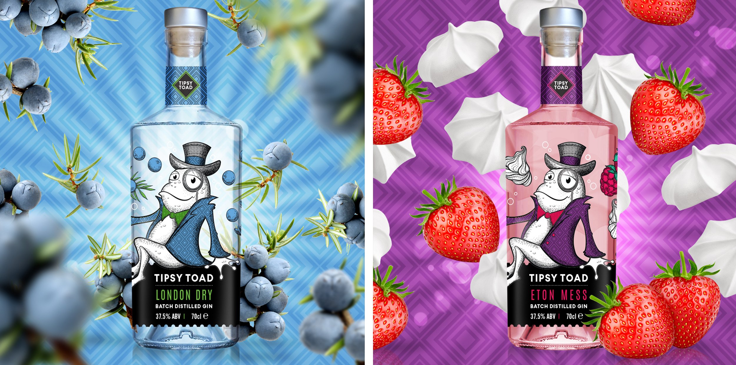
The brand’s mascot — a debonair, slightly inebriated toad — became the heart of the identity. Illustrated with bold lines and a cheeky grin, he sets the tone for the entire visual world: playful, proud, and just the right amount of wild. The design balances humour with quality, appealing to both connoisseurs and casual gin lovers alike.
We created a series of vibrant labels, each with its own distinctive colour palette to reflect the gin’s botanical blends. Strong typography, copper foil accents, and expressive illustrations help the bottles hold their own in busy retail or bar environments. The result is a brand that feels both premium and full of personality.
From tone of voice to illustration, every detail is designed to feel like a good time in a bottle. Tipsy Toad invites people to sip, smile, and not take themselves too seriously — a refreshing change in a market often wrapped in tradition.