


Packaging Design & Illustration
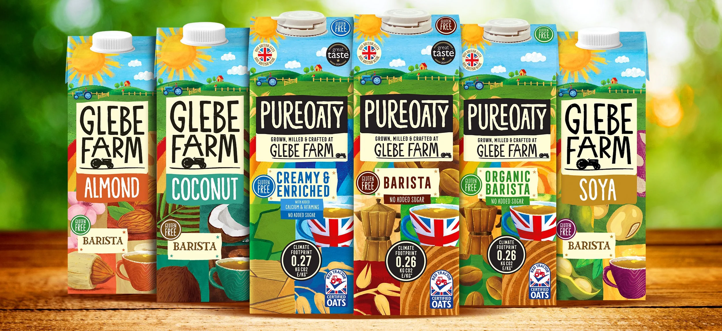
Glebe Farm is a proudly independent, family-run business producing pure British oats and plant-based milks from their farm in Cambridgeshire. We were brought in to refresh their on-pack identity — something that would better reflect the natural, home-grown quality of their products and connect with a health-conscious, eco-minded audience.
We developed a soft, hand-illustrated visual style to mirror the brand’s gentle, down-to-earth ethos. Rolling hills, oat stalks, and warm sunrises wrap around the pack, creating a sense of place and calm. It’s a visual nod to where the product comes from — honest, simple, and close to nature.
Everything about the design aims to emphasise provenance, transparency, and care — from subtle detailing to the muted colour palette. It’s not trying to shout; it’s designed to feel real, rooted, and considered — a shelf presence that invites trust at first glance.
The typographic palette was chosen for its warmth and legibility. The combination of clean sans-serif and friendly serif styles gives the packaging a grounded feel while allowing key product info to shine. It’s accessible, trustworthy, and quietly confident — just like the brand itself.